Packers Sanitation
Services Inc. (PSSI)
PSSI is a contract sanitation company specializing in food processing facilities. When PSSI first came to Bernstein-Rein (BR), they referred to themselves as contract cleaners. But BR saw a bigger opportunity. Because what they do isn’t just about sanitizing food processing facilities. PSSI protects the food the whole world eats. So, BR transformed PSSI from contract cleaners to protectors of food.
During this process, I worked with the team to help create and establish PSSI’s brand. I developed the logo, iconography and sales book for PSSI. I also assisted with the website design, brand guidelines, and creating assets for the brand launch campaign. After the brand launch campaign I began leading art direction for PSSI.
BRANDING
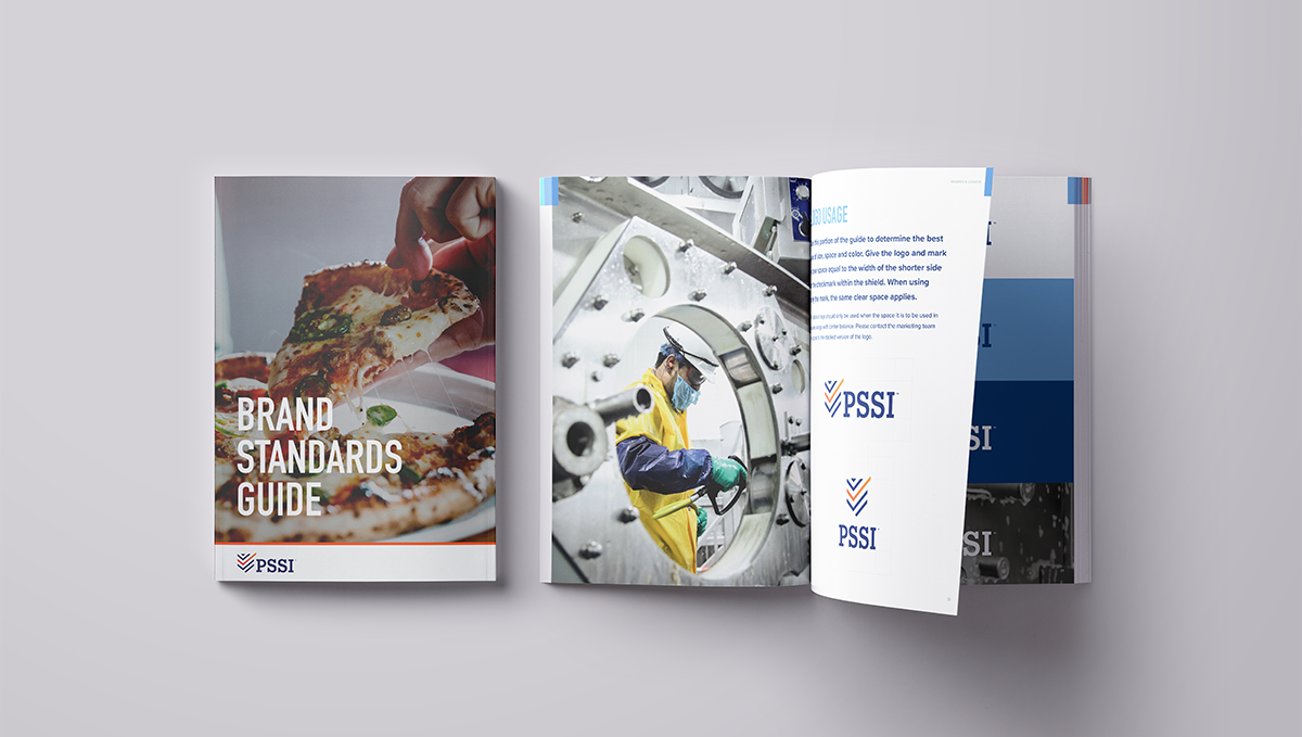
When I joined the agency, the team was on their 3rd round of logos to show the client. PSSI wanted a logo that kept the checkmark from their old logo, but also a shield in their new logo. The solution below was the one I came up with: a modern, flat logo design that integrated the two request, with an emphasis on the checkmark.

ICONOGRAPHY
With the many technical aspects of PSSI’s work, I recommended we create an iconography system. I developed a multi-tier system of icons, glyphs, and illustrations to denote specific processes or subjects that could be explained through iconography. I kept each simple and rooted in the brand. Glyphs, icons, and illustrations each had their own set of rules when is written below.

ICONOGRAPHY / GLYPHS
Glyphs were designed at 16 px, had a stroke of no bigger than 1 pt, and were one color.

ICONOGRAPHY / ICONS
Icons were designed at 72 px, had a stroke of 3 pt, rounded end caps, and were one color.

ICONOGRAPHY / ILLUSTRATIONS
Illustrations contained an existing icon which is considered the primary icon. It used the orange gradient we use for PSSI. The secondary elements used the blue gradient. They all sit on a stroke that is no longer than 200 px wide and had the same 3/4 circle for the background for consistency. The illustrations also used a 3 pt stroke.

PRINT ADS
For the brand launch campaign of PSSI, our print ads focused on protecting the food you eat and the moments you share while eating. We pulled the double check from the logo to use on the print ads as a sign that PSSI double checks every time.


WEBSITE DESIGN


OTHER COLLATERAL


OTHER PROJECTS

FIRST
FEDERAL
BANK

INNOVIA
MEDICAL

PKD
FOUNDATION

WATEREQUITY